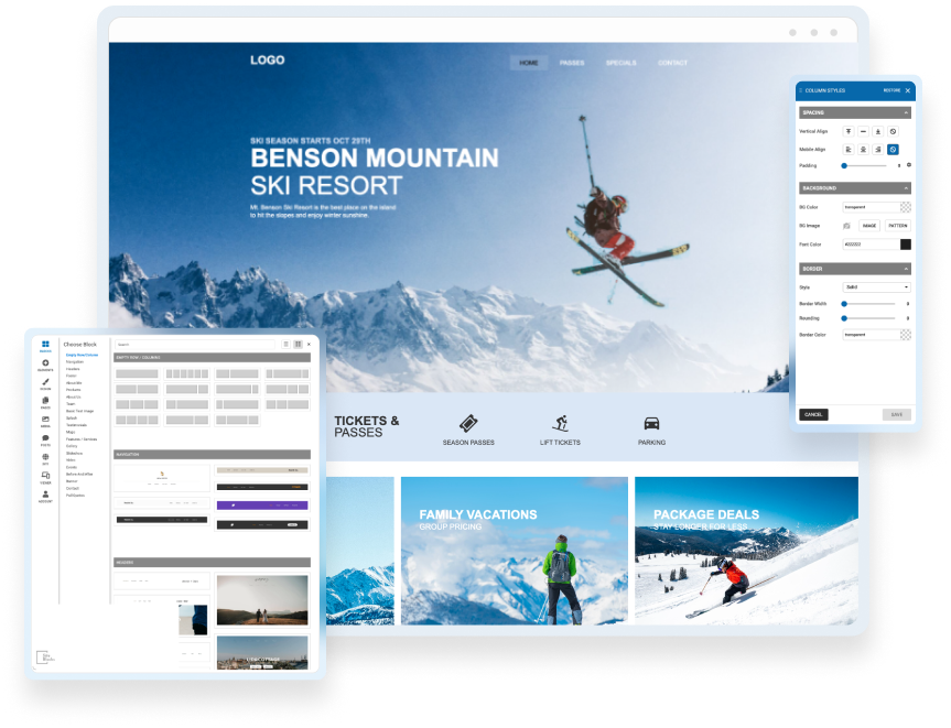

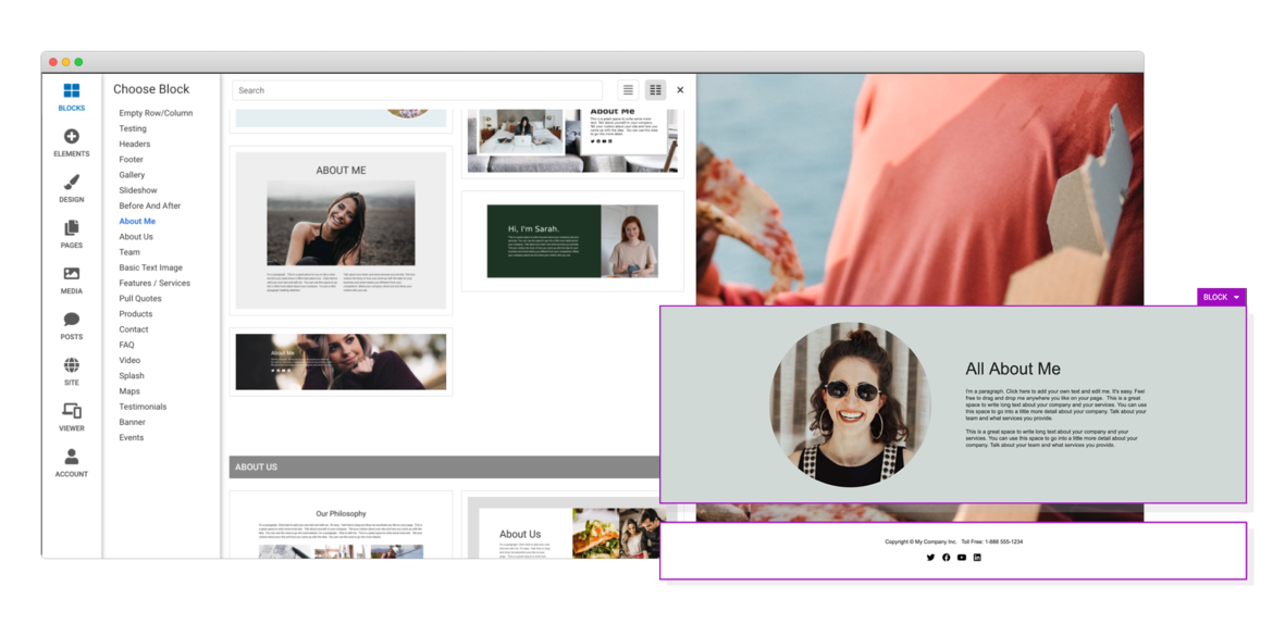
Drag & Drop Components
Choose from dozens of components to add to your website. We offer everything from responsive image galleries, to HTML 5 video players, contact forms, maps, e-commerce, blogging and more.
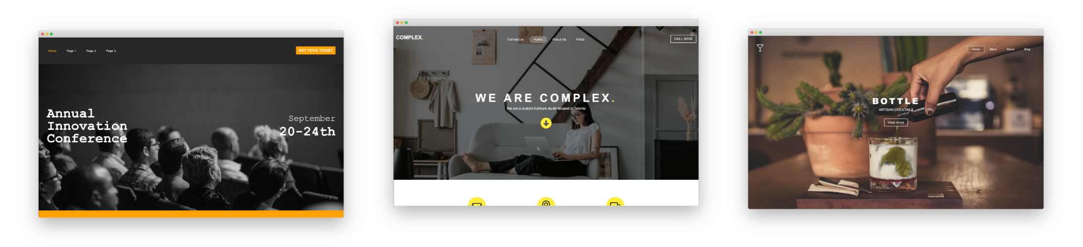
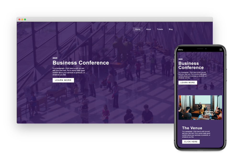
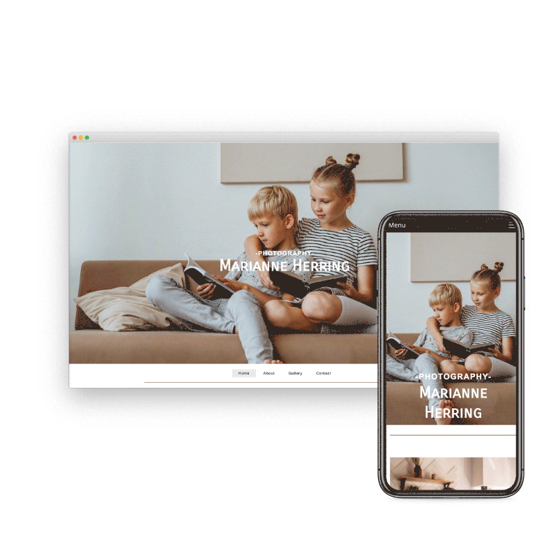
Responsive For Mobile
Going from laptop to smartphone, your site will always look its best. It works on multiple screen sizes such as laptops, smartphones, and tablets. And you can even hide and show blocks on different devices!

Choose Your Own Domain
SiteBlocks provides domain registration at excellent rates as well as easy to use domain management tools. You have your choice from hundreds of great new domains like .ca, .com, .net, and .org
Beautiful Galleries
Easily store and share your photos online. Share all your favorite memories with family and friends. Allow them to upload photos too.


E-Commerce
We make it easy to setup an online store using the Ecwid shopping cart system. Or, use our PayPal integration to have a shopping cart and “Buy it Now” buttons. Trying to raise money? We have donation buttons as well! Have stuff on eBay, or an eBay store? We’ve got that covered too, just add an eBay element to your page and it will stay up-to-date with your items on eBay.
Preview & Share
When creating a website with SiteBlocks, we make sure that your content is already responsive and dynamic so that your viewers can access your pages on an variety of devices with ease.
Need to see how your website looks on a different device type? You can use our built-in viewer to preview pages on a variety of devices, both in portrait and landscape!
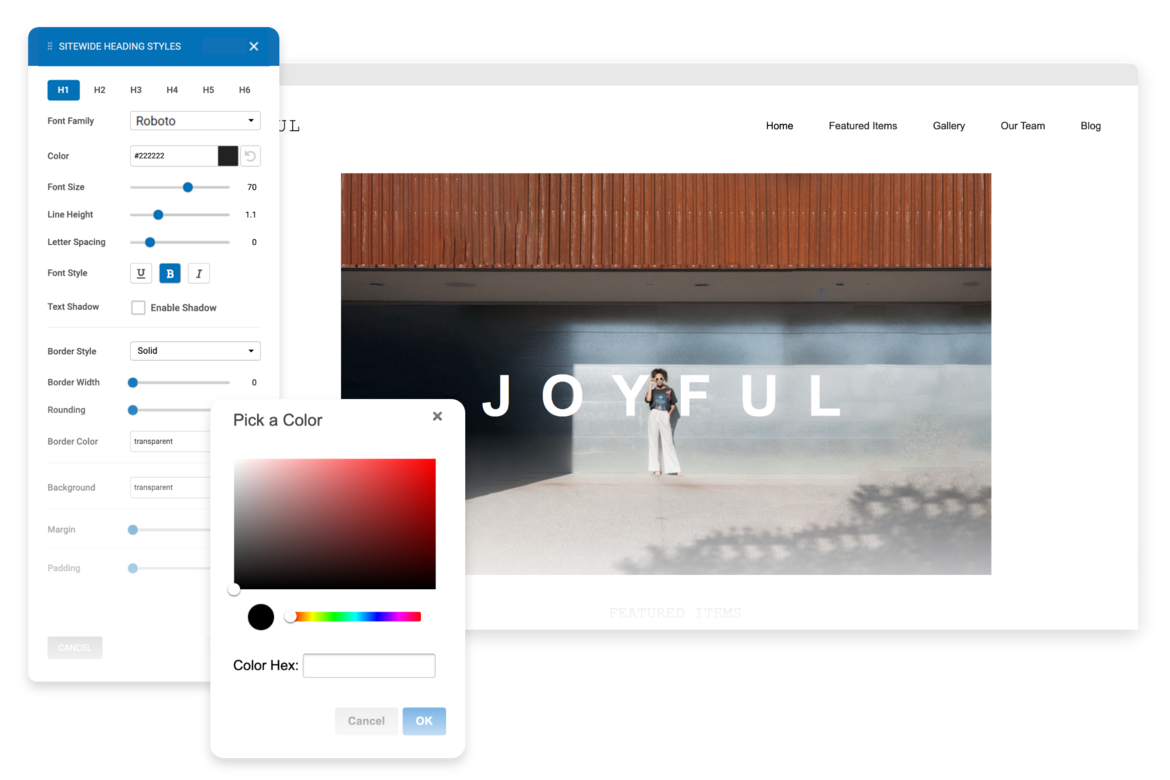
Edit & Style
If you choose to use one of our professionally built templates or pre-built blocks you can still make it your own by changing the text, colors, fonts and images.
Create Your Own Blog
If you love writing, you will love our blogging system. With full control over the format of your blog posts, you can schedule posts for a later date.
Want your readers to follow along? The system generates an RSS feed which they can subscribe to. Readers can comment on your posts which you can manage and moderate right in SiteBlocks.

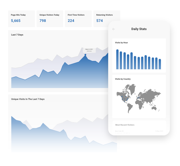
Real-Time Website Statistics
We provide built-in statistics to help you monitor your traffic, view referrers, daily visitors, unique visitors, and more. Review your history from one week to several years.
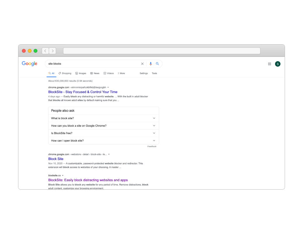
Search Engine Optimization
Search Engine Optimization (SEO) is built-in. We offer beautiful semantic URLs, page-specific meta keywords and descriptions, and an auto-generated sitemap to improve search engine ranking.
In addition, we provide a handy SEO checker to ensure you get maximum results.
And So Much More...
Drag and Drop
Social Media
Cloud Hosting
Security
Contact Forms
Uptime Guarantee
Content Management
Inline Editable
- Services
- Web Hosting
- Site Builder
- Email Hosting
- Blogs
- Email Marketing
- Domains
- SSL Certificates
- Contact Forms
- Password Protect
- Photo Albums
- Guestbooks
- Message Forums
- Online Calendars
- Counters & Site Stats
- Online Stores
- Contact
- Support Center
- Webmail Access
- Advertisers
- Abuse
- X
- Company
- About Bravenet
- Corporate Web Design
- Marketing & SEO Services
- Sitemap
- Terms of Use
- Privacy Policy
Bravenet is a leading webmaster services provider, providing website services to millions of users worldwide. Our user-friendly webmaster products make creating a creative web presence fun and easy.
From buying a domain and building a website, to adding interactive features like a message board, contact form, guestbook or poll, Bravenet provides all the web tools you need. Bravenet provides the promotion and marketing tools you need to establish a successful, high-quality, business or personal, internet presence.
© 2024 Bravenet Web Services Inc.

